

Brand Design
Glidden Point Oyster Farms
Project Overview
Glidden Point Oyster Farms needed brand assets that reflected the premium oysters they sell. After years of experimenting with different styles, they decided they needed unified assets rooted in the river’s heritage for consistency across all marketing channels.
The Solution
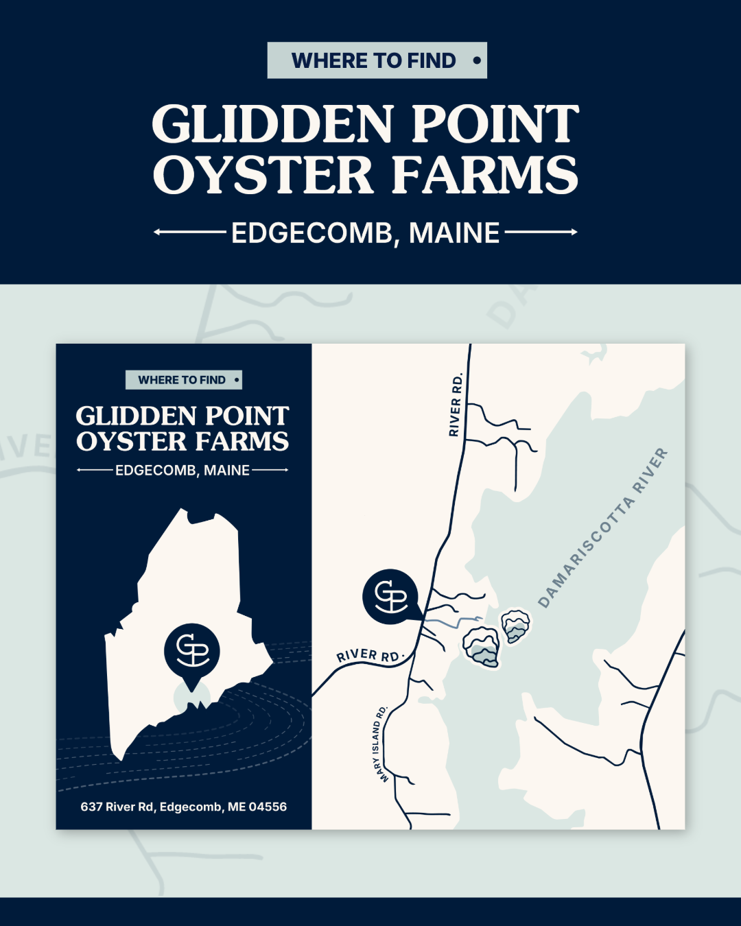
I worked closely with the Director of Marketing to start from the ground up: learning the Glidden Point story. Learning more about the company's history and the river they grow their oysters in greatly influenced the design choices I made. They didn't want to look like another generic seafood brand, so every asset was designed to connect audiences directly to the cold waters and craftsmanship behind Glidden Point.
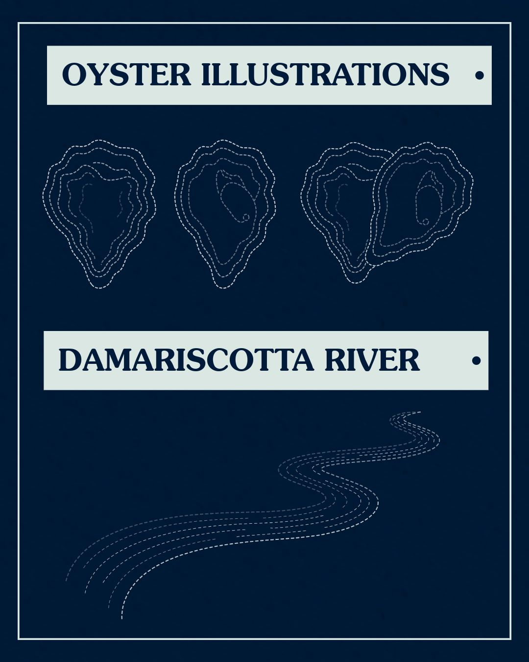
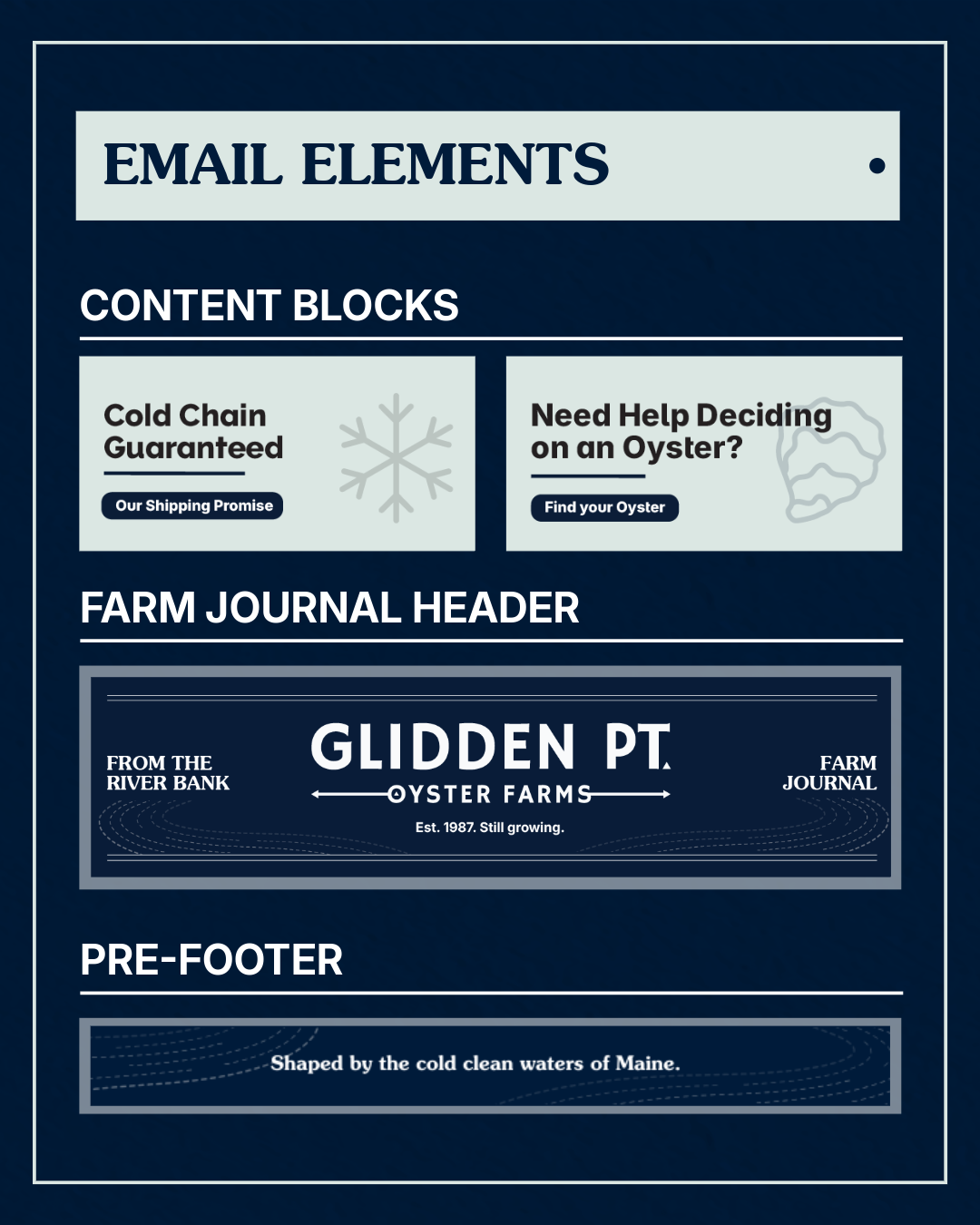
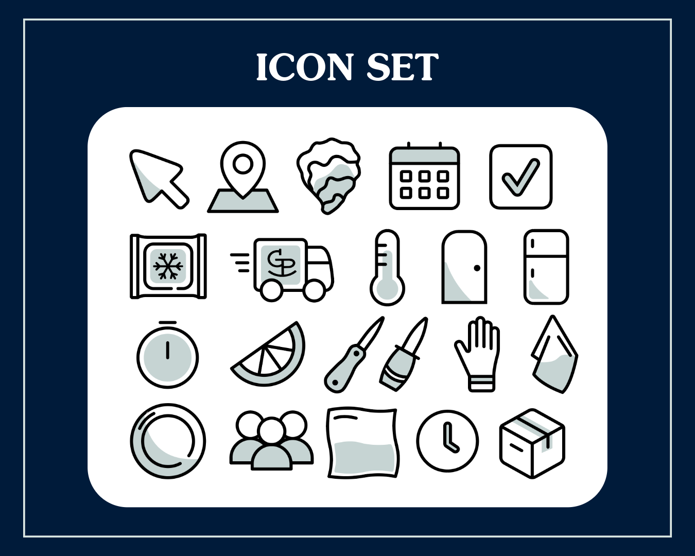
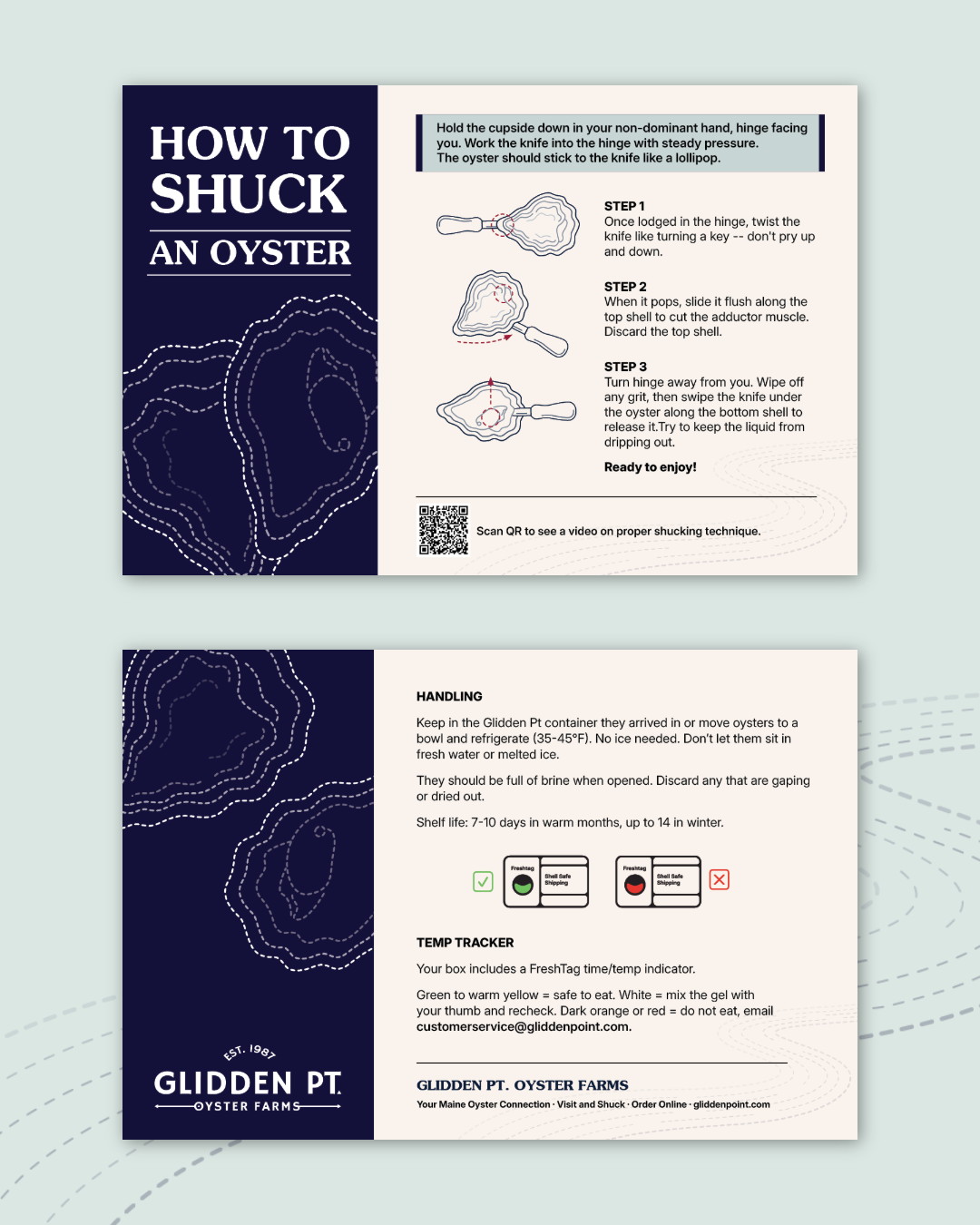
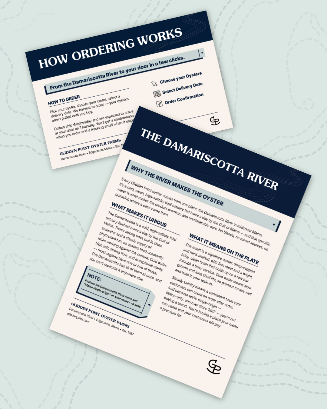
I started with creating signature illustrations of the oysters and the Damariscotta River, a personalized icon set, and new font pairings, From there, I was able to design elements for email templates, a series of one pagers and templates the team could use to recreate their own, promotional post cards, and more. This project taught me how crucial authentic storytelling is to brand strategy.
Client
Glidden Point Oyster Farms
Glidden Point Oyster Farms
Year
2026
2026
Design Software
Adobe Illustrator
Adobe InDesign
Adobe Photoshop
Canva
Adobe Illustrator
Adobe InDesign
Adobe Photoshop
Canva